Instructions for Side by Side Printing
- Print the notecards
- Fold each page in half along the solid vertical line
- Cut out the notecards by cutting along each horizontal dotted line
- Optional: Glue, tape or staple the ends of each notecard together
General Statistics: Ch 2 HW
front 1 After constructing a relative frequency distribution summarizing IQ scores of college students, what should be the sum of the relative frequencies? | back 1 If percentages are used, the sum should be 100%. If proportions are used, the sum should be 1. |
front 2 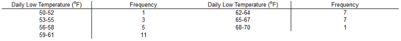 Identify the class width, class midpoints, and class boundaries for the given frequency distribution. What is the class width? What are the class midpoints? What are the class boundaries? | back 2 3 51, 54, 57, 60, 63, 66, 69 49.5, 52.5, 58.5, 61.5, 64.5, 67.5, 70.5 |
front 3 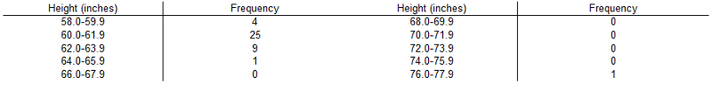 Identify the class width, class midpoints, and class boundaries for the given frequency distribution. What is the class width? What are the class midpoints? What are the class boundaries? | back 3 2 58.95, 60.95, 62.95, 64.95, 66.95, 68.95, 70.95, 72.95, 74.95, 76.95 57.95, 59.95, 61.95, 63.95, 65.95, 67.95, 69.95, 71.95, 73.95, 75.95, 77.95 |
front 4 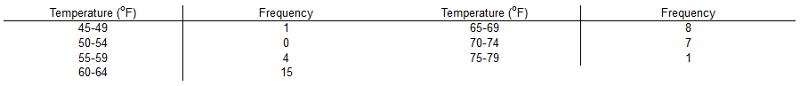 Does the frequency distribution appear to have a normal distribution using a strict interpretation of the relevant criteria? | back 4 No, the distribution does not appear to be normal. |
front 5 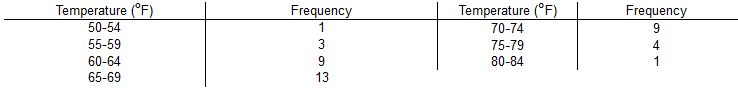 Does the frequency distribution appear to have a normal distribution? Explain. | back 5 Yes, because the frequencies start low, proceed to one or two high frequencies, then decrease to a low frequency, and the distribution is approximately symmetric. |
front 6 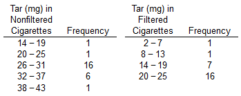 Construct one table that includes relative frequencies based on the frequency distributions shown below, then compare the amounts of tar in nonfiltered and filtered cigarettes. Do the cigarette filters appear to be effective? | back 6 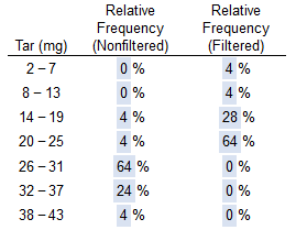 Yes, because the relative frequency of the higher tar classes is greater for nonfiltered cigarettes. |
front 7 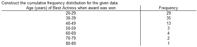 Construct the cumulative frequency distribution for the given data. | back 7 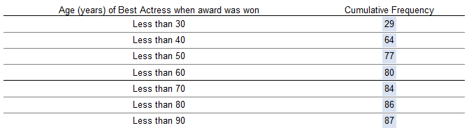 |
front 8 Weights of statistics students were obtained by a teacher as part of an experiment conducted for the class. The last digit of those weights are listed below. Construct a frequency distribution with 10 classes. 0 0 0 0 0 0 0 0 0 1 2 2 3 4 4 4 5 5 5 5 5 5 5 5 5 6 6 8 8 9 9 Based on the distribution, do the weights appear to be reported or actually measured? What can be said about the accuracy of the results? | back 8  The weights appear to be reported because there are disproportionately more 0s and 5s. They are likely not very accurate because they appear to be reported. |
front 9 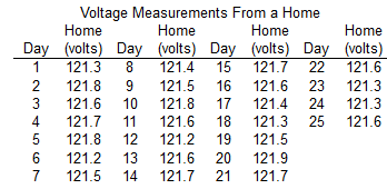 Refer to the accompanying data set and use the 25 home voltage measurements to construct a frequency distribution with five classes. Begin with a lower class limit of 121.1 volts, and use a class width of 0.2 volt. Does the result appear to have a normal distribution? Why or why not? | back 9 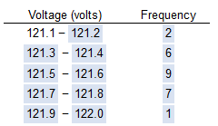 Yes, because the frequencies start low, reach a maximum, then become low again, and are roughly symmetric about the maximum frequency. |
front 10  The data represents the daily rainfall (in inches) for one month. Construct a frequency distribution beginning with a lower class limit of 0.00 and use a class width of 0.20. Does the frequency distribution appear to be roughly a normal distribution? | back 10  No, the distribution is not symmetric and the frequencies do not start off low. |
front 11 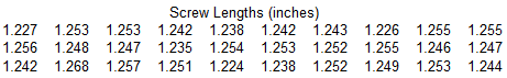 Refer to the accompanying data set and use the 30 screw lengths to construct a frequency distribution. Begin with a lower class limit of 1.220 in, and use a class width of 0.010 in. The screws were labeled as having a length of 1 1/4 in. Does the frequency distribution appear to be consistent with the label? Why or why not? | back 11 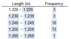 Yes, because the frequencies are greatest in the closest to the labeled size. |
front 12 Among fatal plane crashes that occurred during the past 65 years, 657 were due to pilot error, 71 were due to other human error, 613 were due to weather, 348 were due to mechanical problems, and 581 were due to sabotage. What is the most serious threat to aviation safety, and can anything be done about it? | back 12 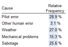 Pilot error is the most serious threat to aviation safety. Pilots could be better trained. |
front 13 Which characteristic of data is a measure of the amount that the data values vary? | back 13 Variation |
front 14 Class width is found by _______. | back 14 subtracting a lower class limit from the next consecutive lower class limit Class width is the difference between two consecutive lower class limits or two consecutive lower class boundaries in a frequency distribution. |
front 15 The population of ages at inauguration of all U.S. Presidents who had professions in the military is 62, 46, 68, 64, 57. Why does it not make sense to construct a histogram for this data set? | back 15 With a data set that is so small, the true nature of the distribution cannot be seen with a histogram. |
front 16 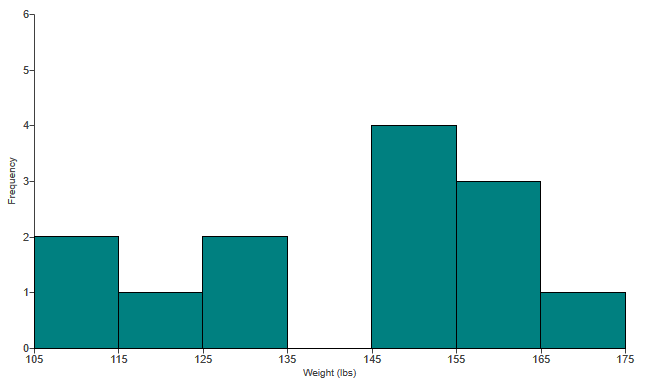 The histogram to the right represents the weights (in pounds) of members of a certain high-school debate team. What is the class width? What are the approximate lower and upper class limits of the first class? | back 16 The class width is 10. The approximate lower class limit is 105.The approximate upper class limit is 115. |
front 17 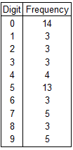 The last digit of the heights of 56 statistics students were obtained as part of an experiment conducted for a class. Use the frequency distribution to the right to construct a histogram. What can be concluded from the distribution of the digits? Specifically, do the heights appear to be reported or actually measured? | back 17 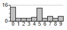 The data appears to be reported. Certain heights occur a disproportionate number of times. |
front 18 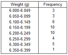 The table below shows the frequency distribution of the weights (in grams) of pre-1964 quarters. Use the frequency distribution to construct a histogram. Does the histogram appear to depict data that have a normal distribution? Why or why not? | back 18 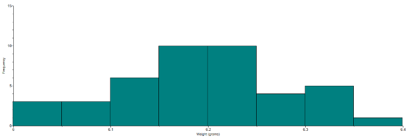 The histogram appears to depict a normal distribution. The frequencies generally increase to a maximum and then decrease, and the histogram is roughly symmetric. |
front 19 A bar chart and a Pareto chart both use bars to show frequencies of categories of categorical data. What characteristic distinguishes a Pareto chart from a bar chart, and how does that characteristic help us in understanding the data? | back 19 In a Pareto chart, the bars are always arranged in descending order according to frequencies. The Pareto chart helps us understand data by drawing attention to the more important categories, which have the highest frequencies. A bar chart uses bars of equal width to show frequencies of categorical data. The vertical scale represents frequencies or relative frequencies. The horizontal scale identifies the different categories of qualitative data. When one wants a bar chart to draw attention to the more important categories, one can use a Pareto chart, which is a bar chart for categorical data, with the added stipulation that the bars are arranged in descending order according to frequencies. The bars decrease in height from left to right. |
front 20 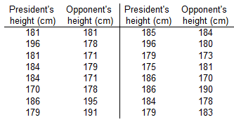 The table provided below shows paired data for the heights of a certain country's presidents and their main opponents in the election campaign. Construct a scatterplot. Does there appear to be a correlation? | back 20 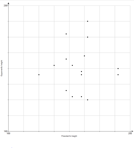 No, there does not appear to be a correlation because there is no general pattern to the data. |
front 21 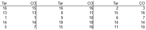 Construct a scatter diagram using the data table to the right. This data is from a study comparing the amount of tar and carbon monoxide (CO) in cigarettes. Use tar for the horizontal scale and use carbon monoxide (CO) for the vertical scale. Determine whether there appears to be a relationship between cigarette tar and CO. | back 21 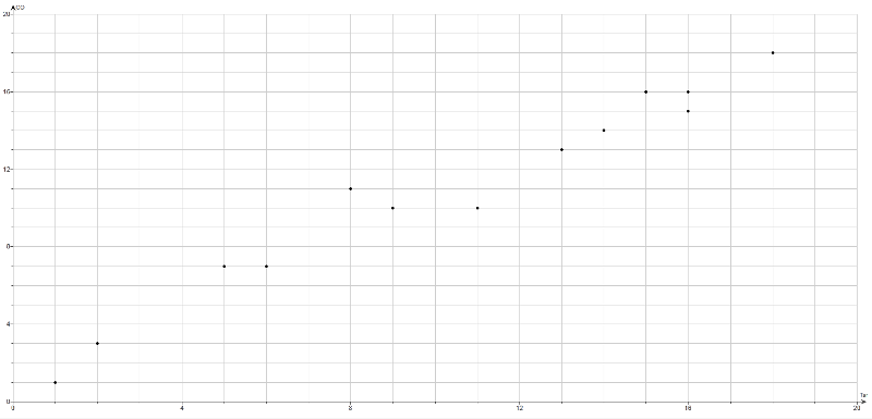 Yes, as the amount of tar increases the amount of carbon monoxide also increases. |
front 22 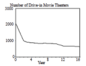 Given below are the numbers of indoor movie theaters, listed in order by row for each year. Use the given data to construct a time-series graph. What is the trend? How does this trend compare to the trend for drive-in movie theaters? | back 22 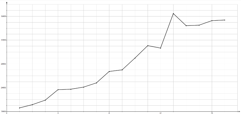 There appears to be an upward trend, unlike drive-in movie theaters, which have a downward trend. |
front 23 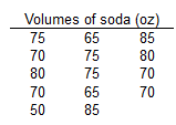 The data table to the right represents the volumes of a generic soda brand. | back 23 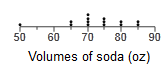 Yes, the population appears to have a normal distribution because the dotplot resembles a "bell" shape. When graphed, a normal distribution has an approximate "bell" shape. In a normal distribution, (1) the frequencies increase to a maximum and then decrease, and (2) the graph has symmetry, with the left half of the graph being roughly a mirror image of the right half. Yes, the volume of 50 oz appears to be an outlier because it is far away from the other volumes. Outliers are sample values that lie very far away from the vast majority of the other sample values. |
front 24 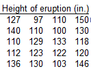 The data represents the heights of eruptions by a geyser. Use the heights to construct a stemplot. Is there strong evidence suggesting that the data are not from a population having a normal distribution? | back 24 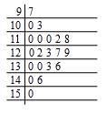 No, the distribution is not dramatically far from being a normal distribution with a "bell" shape, so there is not strong evidence against a normal distribution. When plotted, a normal distribution has an approximate "bell" shape. In a normal distribution, the frequencies increase to a maximum and then decrease, and the distribution has symmetry, with the frequencies of the lower values being roughly a mirror image of the frequencies of the higher values. |
front 25 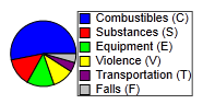 In a recent year, 4386 people were killed while working. Here is a breakdown of causes: combustibles (2329); substances (605); equipment (590); violence (465); transportation ( 204); falls (193). Use the data to construct a Pareto chart. Compare the Pareto chart to the pie chart. Which graph is more effective in showing the relative importance of the causes of work-related deaths? | back 25 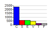 A. The Pareto chart is better because it more clearly draws attention to the main cause of work-related death. |
front 26 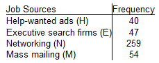 A study was conducted to determine how people get jobs. The table lists data from 400 randomly selected subjects. Construct a Pareto chart that corresponds to the given data. If someone would like to get a job, what seems to be the most effective approach? | back 26 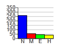 Networking (N) |
front 27 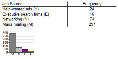 A study was conducted to determine how people get jobs. The table below lists data from 400 randomly selected subjects. Compare the pie chart found above to the Pareto chart given on the left. Can you determine which graph is more effective in showing the relative importance of job sources? | back 27 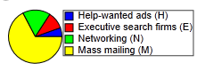 The Pareto chart is more effective. |
front 28 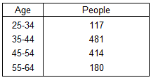 The given data represent the number of people from a town, aged 25-64, who subscribe to a print magazine. Construct a frequency polygon. Applying a loose interpretation of the requirements for a normal distribution, does the data appear to be normally distributed? Why or why not? | back 28 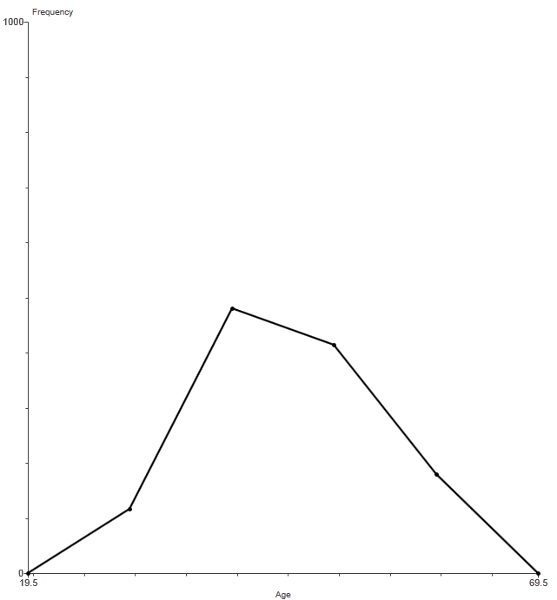 The frequency polygon appears to roughly approximate a normal distribution because the frequencies increase to a maximum, then decrease, and the graph is roughly symmetric. When graphed, a normal distribution has an approximate "bell" shape. In a normal distribution, the frequencies increase to a maximum and then decrease, and the distribution has symmetry, with the frequencies of the lower values being roughly a mirror image of the frequencies of the higher values. |
front 29 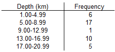 The given data represents a frequency distribution of the depth of recent earthquakes. Use the frequency distribution to construct a frequency polygon. Applying a strict interpretation of the requirements for a normal distribution, do the depths appear to be normally distributed? Why or why not? | back 29 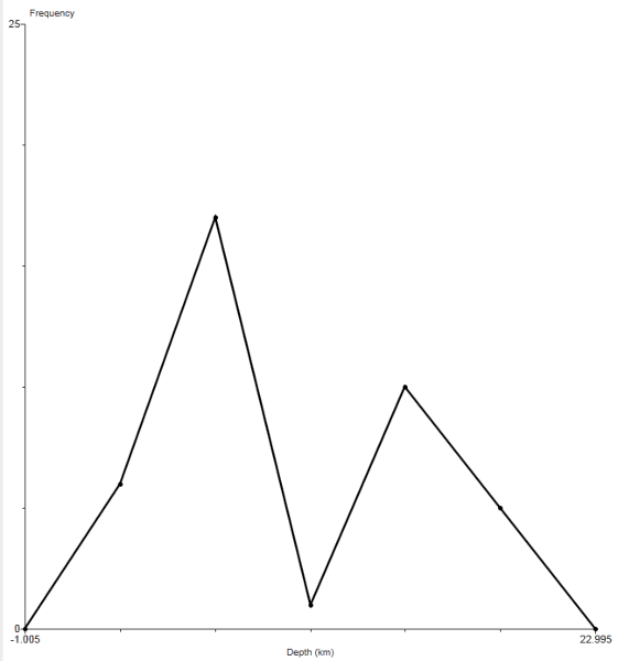 The frequency polygon does not appear to approximate a normal distribution because the frequencies do not increase to a maximum and then decrease, and the graph is not symmetric. When graphed, a normal distribution has an approximate "bell" shape. In a normal distribution, the frequencies increase to a maximum and then decrease, and the distribution has symmetry, with the frequencies of the lower values being roughly a mirror image of the frequencies of the higher values. |
front 30 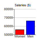 The graph to the right compares teaching salaries of women and men at private colleges and universities. What impression does the graph create? Does the graph depict the data fairly? If not, construct a graph that depicts the data fairly. | back 30 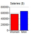 The graph creates the impression that men have salaries that are more than twice the salaries of women. No, because the vertical scale does not start at zero. |
front 31 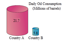 The graph to the right uses cylinders to represent barrels of oil consumed by two countries. Does the graph distort the data? Why or why not? If the graph distorts the data, construct a graph that depicts the data fairly. | back 31  Yes, because the graph incorrectly uses objects of volume to represent the data. |
front 32 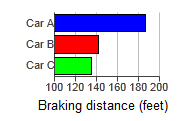 The graph to the right shows the braking distances for different cars measured under the same conditions. Describe the ways in which this graph might be deceptive. How much greater is the braking distance of Car A than the braking distance of Car C? Draw the graph in a way that depicts the data more fairly. | back 32 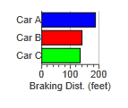 By starting the horizontal axis at 100, the graph cuts off portions of the bars. The braking distance of Car A is about 40% greater than the braking distance of Car C. |
front 33 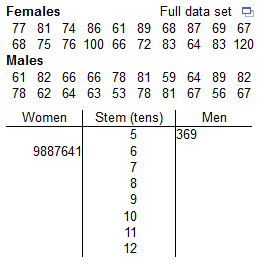 A format for back-to-back stemplots representing the pulse rate of females and males from the given data is shown below. Complete the back-to-back stemplot, then compare the results. | back 33 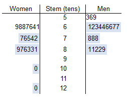 The distribution of pulse rates for men is concentrated, centered around 60, whereas the distribution of pulse rates for women is more spread out, centered around 70. |
front 34 Which of the following is NOT true about statistical graphs? | back 34 They utilize areas or volumes for data that are one-dimensional in nature. Utilizing two- or three-dimensional pictures to represent one-dimensional data is poor practice and distorts the data. |
front 35 Which of the following is a common distortion that occurs in graphs? | back 35 Using a two-dimensional object to represent data that are one-dimensional in nature Using a two-dimensional object to represent data that are one-dimensional in nature is a bad practice that distorts the meaning of the data. When drawing such objects, artists can create false impressions that distort differences. |
front 36 Why is it important to learn about bad graphs? | back 36 So that we can critically analyze a graph to determine whether it is misleading We should be aware of how easy it is to distort data. Learning about bad graphs teaches us to critically analyze a graph to determine whether it is misleading. |