What is a simple definition of [data] visualization?
Convey graphical information derived from data. It is based on exploiting the human visual system as a means of communication because it is a very high-bandwidth channel to the brain.
NOTE: Visualizations USED TO refer to mental images that people formed while they thought...
What are the four main functions of data visualization?
(1) To record information / have a graphical record of something; (2) to analyze data, reveal trends and patterns, and support reasoning; (3) confirm a hypothesis about the data; (4) communicate ideas / persuade / convince / inspire others.
When was the first mouse patented--and by whom?
In 1967 by Doug Engelbart at Augmentation Research Center (ARC). In 1968 he performed what is now called The Mother of all Demos where he showed off the mouse.
Why is visualization important?
We're in the "revolution of industrial data" and data collection has never been easier--and will continue to get easier. We have RFID sensors, road sensors, live cameras, traffic sensors, chips everywhere and it will only increase.
What's another reason visualization is important?
We just have too much data. For example, a telescope used to just give a view of the skies. But now telescopes collect terabytes and petabytes of data that needs analysis.
What did Hal Varian, Google's Chief Economist say about data in the McKinsey Quarterly, Jan. 2009?
“The ability to take data—to be able to understand it, to process it, to extract value from it, to visualize it, to communicate it—that’s going to be a hugely important skill in the next decades... because now we really do have essentially free and ubiquitous data.”
What are some of the human challenges with absorbing all the data that's available?
We have limits of cognition; we are easily distracted; we are already multitasking and can only absorb so much; we are forgetful and our working memory only has so much active capacity; we have attentional blindness; etc. Visualization helps us keep up.
What are some of the benefits of visualization?
Helps us think; uses perception to offload cognition; converts static data into useful information; serves as an external aid (e.g. when we record and store) to augment working memory; allows us to see vast amounts of information within our limited field of view; accelerates search and cognition; boosts our cognitive abilities.
What quotation is attributed to Stuart Card about visulizations?
“Visualization is really about external cognition, that is, how resources outside the mind can be used to boost the cognitive capabilities of the mind.”
How much of the human brain is devoted to the visual sense?
Almost half--clearly dominant
Who taught CS171 Data Visualizations course at Harvard?
Professor Hanspeter Pfister
How close should text that is related to images be placed?
When text and images are related they should be placed in close proximity--and to avoid using, "See Figure X on page..."
How much attentional capacity do humans normally have?
We see very little at any given instant, but we can sample any part of our visual environment so rapidly with swift eye movement, that we think we have all of it at once in our consciousness experience. We get what we need, when we need it.
Explain how our brains have become optimized to have "random access" only when needed:
The brain, like all biological systems, has become optimized over millennia of evolution. Brains have a very high level of energy consumption and must
be kept as small as possible, or our heads would topple us over. Keeping a copy of the world in our brains would be a huge waste of cognitive resources and completely unnecessary. It is much more efficient to have rapid access to the actual world—to see only what we attend to and only attend to what we need—for the task at hand.
How conscious are we about the entire world around us?
Very little. Seeing is all about attention. This new understanding leads to a revision of our thinking about the nature of visual consciousness. It is more accurate to say that we are conscious of the field of information to which we have rapid access rather than that we are immediately conscious of the world.
Define visual thinking:
Visual thinking consists of a series of acts of attention, driving eye movements and tuning our pattern-finding circuits. These acts of attention are called visual queries.
Give some examples of visual queries:
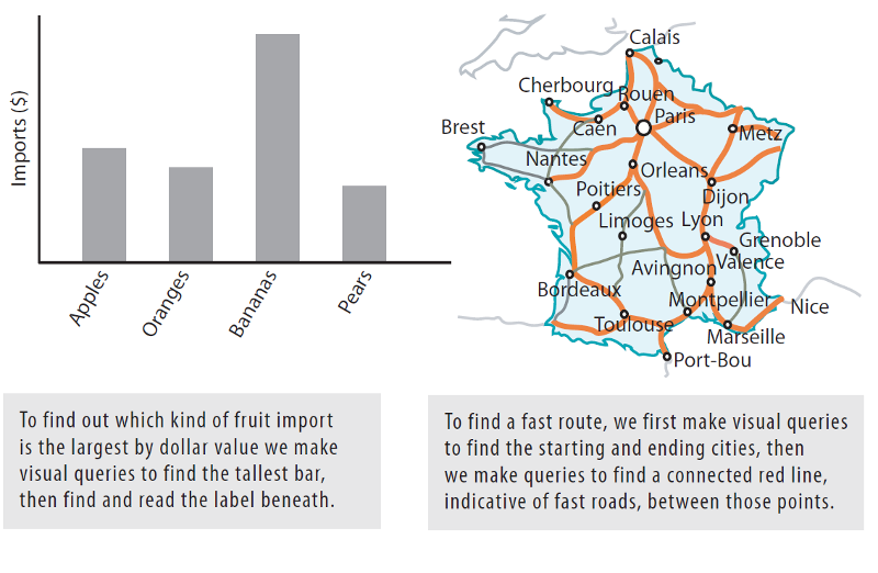
Determine a trend from a stock chart or try to get from point A to B using a map.
Where in our visual field is vision focused for detail?
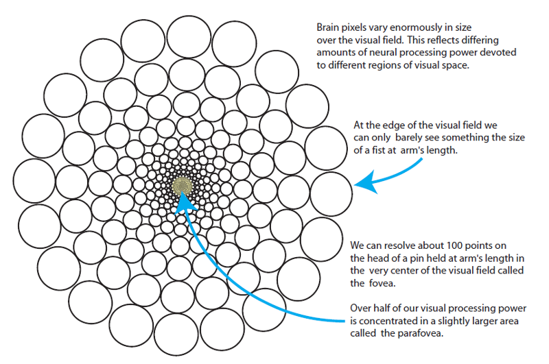
We can resolve about 100 points on the head of a pin held at arm's length in the very center of the visual field called the fovea. (The fovea is like a high-resolution lense.) Over half of our visual processing power is concentrated in a slightly larger area called the parafovea.
Why do we have to move our eyes to process the world around us?
The non-uniformity of the visual processing power is such that half our visual brain power is directed to processing less than 5 percent of the visual world. This is why we have to move our eyes; it is the only way we can get all that brain power directed where it will be most useful. Non-uniformity is also one of the key pieces of evidence showing that we do not comprehend the world all at once. We cannot possibly grasp it all at once since our nervous systems only process details in a tiny location at any one instant.
What is saccadic eye movement?
Rapid movement of both eyes (saccade) which direct the fovea at interesting and useful location, pausing briefly at each, before flicking to the next point of interest.
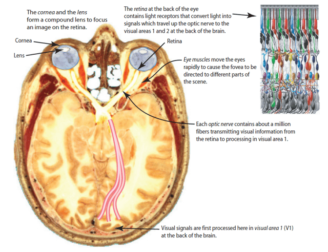
Explain how images are processed at the physiological level:
Explain why we have a blind spot in our vision:
The blind spot is an area of the retina where the optic nerve and blood vessels enter the eye. The brain works around this which is more evidence that seeing is not all the passive registration of information. Rather, it is active and constructive.
Explain bottom-up vs. top-down visual processing:
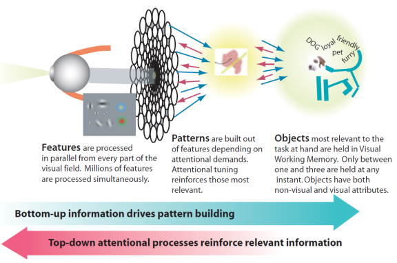
Broadly speaking, the act of perception is determined by two kinds of processes: bottom-up , driven by the visual information in the pattern of light falling on the retina, and top-down , driven by the demands of attention, which in turn are determined by the needs of the tasks.
In third-stage visual processing (after a particular "rough" pattern has been identified in the second stage) how many visual objects does our "visual working memory" hold at any one time.
About three.
Why does it make very good sense to closely couple order entry with a bar chart with technicals that is the basis for placing an order?
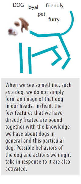
Because visual working memory only holds about three objects which can be displaced by a more task-relevant action. This illustration shows how the binding of concepts that are "activated" (such as seeing a trading signal) and knowledge occurs. Th is momentary binding together of visual information with nonvisual concepts and action priming is central to what it means to perceive something.
Elaborate on our limited capacity of visual working memory and why we can only make due with three or four visual objects at a time:
The reason why we can make do with only three or four objects extracted from the blooming buzzing confusion of the world is that these few objects are made up of exactly what we need to help us perform the task of the moment. Each is a temporary nexus of meaning and action. Sometimes nexus objects are held in mind for a second or two; sometimes they only last for a tenth of a second. Th e greatly limited capacity of visual working memory is a major bottleneck in cognition, and it is the reason why we must often rely on external visual aids in the process of visual thinking.
When we see a pattern, such as a path to exit a room, a "response pattern" (action) is triggered. How can response patterns get traders into trouble?
Response patterns are the essence of the skills that bind perception to action. But they have their egative side, too. Th ey also cause us to ignore the great majority of the information that is available in the world so that we often miss things that are important.
Is "attention" a bottom-up or top-down visual process?
We use the word attention to describe top-down processes. Top-down processes are driven by the need to accomplish some goal. Th is might be an action, such as reaching out and grasping a teacup or exiting a room.
Why does top-down attention cause a "bias" and can be troublesome for technical traders?
If we are looking for red spots then the red spot detectors will signal louder. If we are looking for slanted lines then slanted line feature detectors will have their signal enhanced. This biasing in favor of what we are seeking or anticipating occurs at every stage of processing. What we end up actually perceiving is the result of information about the world strongly biased according to what we are attempting to accomplish.
Related to visual queries, what is the goal of information design?
The goal of information design must be to design displays so that visual queries are processed both rapidly and correctly for every important cognitive task the display is intended to support .
With respect to visual thinking, which is easier? Remembering a cognitive operation or re-doing it? (For example, trying to decide between two routes of a subway map to get to a particular destination.)
Repeating a tracing operation will take less cognitive effort, and require fewer fixations, than finding it in the first place. A hallmark of visual thinking is that it is often easier to redo some cognitive operation than to remember it.
When looking for something, e.g., a point in a map, when the eye arrives at a point of fixation how fast are patterns evaluated?
When the eye arrives at a point of fixation, a process of visual testing begins, and patterns within the central region of the visual field are evaluated at a rate of about twenty per second; although since the eye only stays in one place for less than two-tenths of a second, roughly one to four simple patterns may be evaluated on each fixation.
Why are data visualizations useful?
The are visual aids for our brains which don't remember well. It's "things" from the external world that make us smart and visualizations serve as cues to activate this.
Why are visualizations "generally" more useful than text?
Because about half of our brains are wired for perception (seeing) and visualizations take advantage of that. Visualizations allow elements to pop out at us vs. text which gives us something to think about (important point).
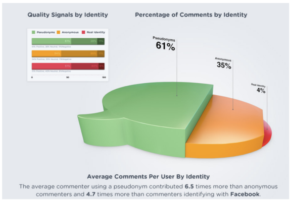
Is this an effective or ineffective data visualization?

Although it does have nice graphic design, it generally fails as an effective data visualization because: (1) It doesn't quickly communicate; (2) it forces the user to use cognitive rather than visual; (3) the 35% is incorrectly scaled and distorts the data. Good data visualizations have more to do with data integrity than "cool" design from the graphics world realm.
According to Edward Tufte, what is design excellence?
“Well-designed presentations of interesting data are a matter of substance, of statistics, and of design.”
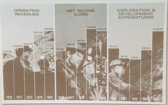
As a data visualization, what's wrong with this image?
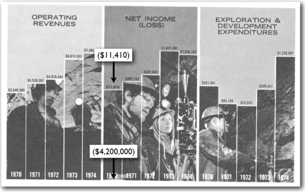
(1) The scales are distorted; (2) The design "invites" you to almost compare them equally; (3) the superimposed picture doesn't add anything to making the data understandable--it's almost a gimmick; (4) scales for bar graphs should always start at zero: If -$11,000 is where it's shown, then the bottom of the graph in this perspective is actually at -$4,200,000.
What is the "lie factor" that Edward Tufte refers to?
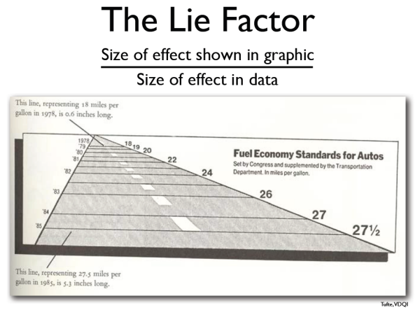
It's distorting the data with graphics that aren't accurate or representative of scale

What is the lie factor of this image?
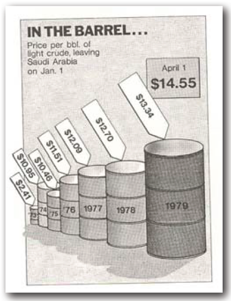
The barrels are not to scale based on the actual data. This is a problem because our visual system is dominant and automatically distorts the actual numerical scale / ratio of increase in price. In this case, the 2D barrels are processed as "3D" volumetric measurements that are grossly distorted.
What are Edward Tufte's three principles of data visualization integrity?
1. Clear, detailed, and thorough labeling should be used to defeat graphical distortion and ambiguity.
2. The representation of numbers, as physically measured on the surface of the graphic itself, should be directly proportional to the numerical quantities represented.
3. Most important: Show data variation, not design variation.
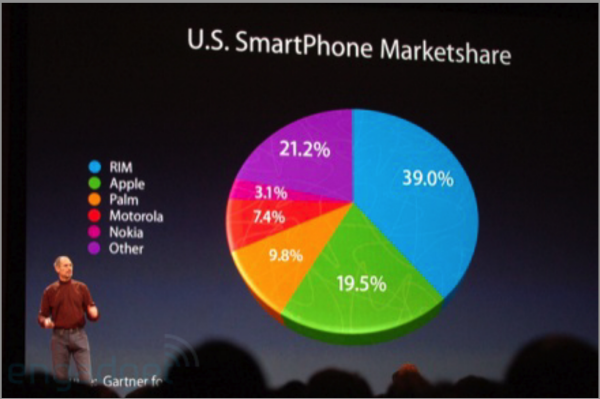
(1) What "trick" is Steve Jobs using here to convey what message? (2) What is the weakness of a pie chart in this instance at communicating accurate data? (3) Which type of chart would give a better picture of comparison?
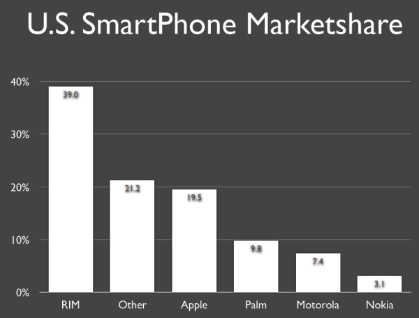
(1) The pie chart distorts the data in Jobs' favor; (2) The pie chart makes it difficult to VISUALLY compare--in an instant--the relative rankings of Smartphone market share; (3) A simple bar graph is the solution because it uses the visual system to quickly process the relative rankings.
Compare pie charts vs. bar charts:
Pie charts measure the composition and components of set of data--and are "flashier"; bar charts rank the components in a clear, relative fashion and often communicate with more integrity. Because of this, bar charts are easier to process visually. The goal is to take advantage of the visual system so that the data pops out.
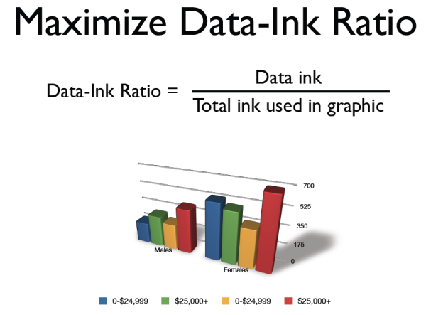
Explain Edward Tufte's "data-to-ink" ratio:
We want to maximize the ratio of data to ink being used. This graphic is still difficult to interpret. There is a lot of wasted ink in using 3D and creating drop shadows. Is it more compelling than than a 2D bar chart? Yes. Is it more communicative? No. The rule is: Use as little ink as possible to show the data.
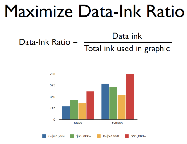
How can we improve on this graph to conform to Tufte's rule of avoiding chartjunk?
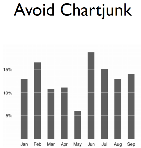
Remove background, horizontal lines, box around graph, even horizontal line at zero. This improved version even uses negative space (white lines intersecting bars) to show the y-axis delineations.
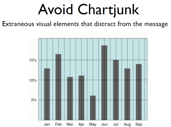
Should chart junk NEVER be used? Are there cases where chartjunk serves one or more purposes? Explain.
There is value in deploying chartjunk in certain circumstances because, as research shows, chartjunk--appropriately used--can be more attractive, entertaining, and/or memorable. But at the sake of data integrity over entertainment, chartjunk should never be used.
What does Tufte mean by saying 'increase data density'?
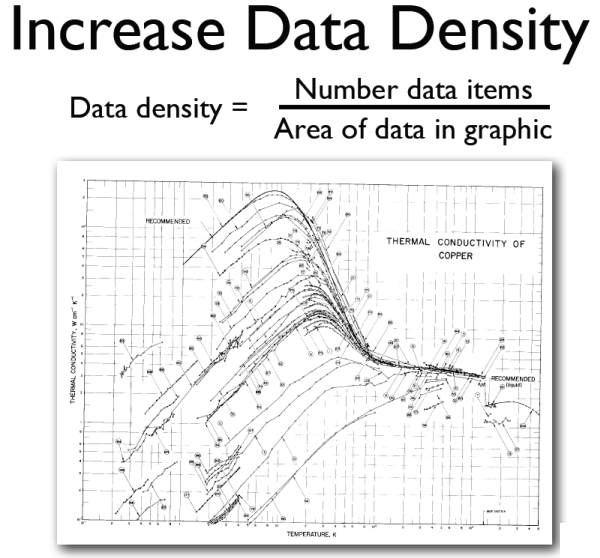
Tufte's 'increase data density' means to put as much visual information into a chart for the given area as you can. Professor Pfister disagrees somewhat (so do I). I believe you want to put as much as necessary to communicate your point(s) (don't overwhelm). This is very germane to mobile.
What are spark lines? Who invented them.
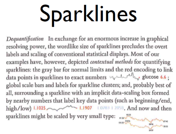
Spark lines were invented by Edward Tufte. They're tiny line charts (often with values nearby) that can be fit right into the text. They can depict an overall trend, such as a trend, in a very small space.
What are Edward Tufte's four design principles?
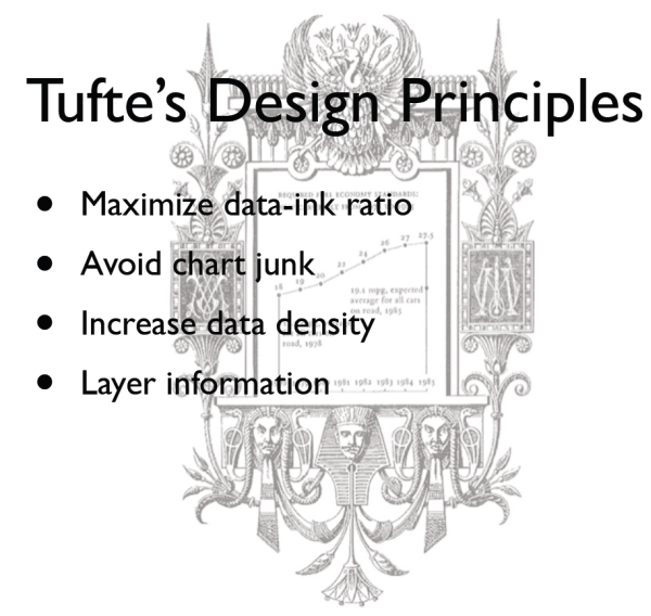
• Maximize data-ink ratio
• Avoid chart junk
• Increase data density
• Layer information (with color, popups, etc.)
n.b. Tufte would hate this graphic -- get rid of that background because it doesn't add anything...
Is chartjunk always harmful?
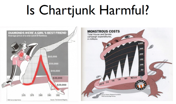
Not necessarily. It depends on audience, context, and goals. These examples will cause the reader to pause because it might attract some readers. But for a government audience, for example, these are out of place.
What are the basic rules for creating graphs?
(1) Present all the data that is needed for the audience to see and understand what’s meaningful; (2) present nothing that isn’t needed; (3) rrepresent data accurately; (4) represent data in a way that is easy for the eyes to perceive and the brain to interpret; (5) provide appropriate context for interpreting the meaning of the data.
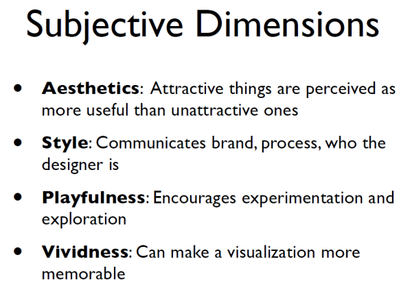
What are some of the subjective dimensions related to graphical embellishments of visualizations?
Professor Pfister believes Tufte is fundamentally right about effectiveness, integrity, and truthfulness in data viz.
What are Robin Williams' (author of Non-designers Design Book) four design principles?
Acronym = CRAP (C.R.A.P.):
1. Contrast--if two things are different, make them REALLY different (don't be a wimp)
2. Repetition--Repeat some aspects of the design throughout the entire piece (e.g., where/how bullets, headings, bold, italics, indents, etc. are used)
3. Alignment--Nothing should be placed on the page arbitrarily. Every item should have a visual connection with something else
4. Proximity--Group related items together... as
physical closeness implies a relationship.
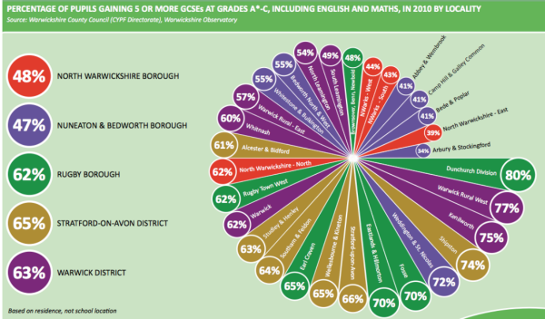
In terms of Tufte's design principles and/or Williams' C.R.A.P. principle, what are some of the problems with this visualization? (It's a failure on both the graphic design side, as well as visualization side.)
1. Data/ink ratio is low: too much saturated and bright (loud) distracting color and unnecessary graphics; contrast is very high--yet two of the purples are similar
2. Chart junk: the spiral takes some time to figure out, even though it does draw the eye into the design; it probably distorts the data, as well.
3. Data density is on the low side
4. Little information is layered here other than the high contrast with colors
5. The fonts seem mixed and not a good choice.
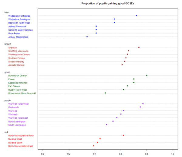
The graphic above is an improvement based on Tufte's design principles.
What is Edward Tufte's quotation re clutter in design?
"Clutter is a failure of design, not an attribute of inspiration."
Name the three "intended tasks" of data visualization according to Tamara Munzner:
(1) Hypothesis generation; (2) hypothesis confirmation; (3) presentation / communication
According to Tamara Munzner, what are the limitations when analyzing a visualization system?
(1) Computational capacity; (2) human perceptual and cognitive capacity (these are finite human resources); (3) display capacity
What is "change blindness" ?
We store surprisingly little information internally in visual working memory, leaving us vulnerable to change blindness: the phenomenon where even very large changes are not noticed if we are attending to something else in our view.
What are some of the things IDEO does in their design process?
(1) Analyze the need; (2) analyze current solution; (3) watch users using current solution; (4) identifying problems of current model; (5) trial and error; (6) teamwork
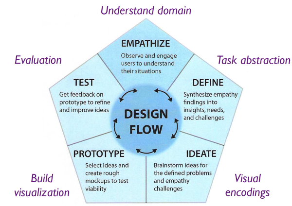
In design, what are the steps in the "Design Flow" process?
Empathize, define, ideate, prototype, test
Explain the Empathize step in the Understand Domain phase of Design Flow:
Observe and engage users to understand their situations
Explain the Define step in the Task Abstraction phase of Design Flow:
Synthesize empathy findings into insights, needs, and challenges
Explain the Ideate step in the Visual Encodings phase of Design Flow:
Brainstorm ideas for the defined problems and empathy challenges
Explain the Prototype step in the Build Visualization phase of Design Flow:
Select ideas and create rough mockups to test viability
Explain the Test step in the Evaluation phase of Design Flow:
Get feedback on prototype to refine and improve ideas
Review the IDEO's Design Flow model which, in the end, is a visualization:
Step 1 is the "target": What is the problem to work on? Lean about users' goals and kinds of data--then get and clean data. Then you need to "translate" that data to structure and characterize the data from which you create an abstraction of the problem--and from there, transform the data computationally. Only once you've done this can you go into the design phase. Then comes implementation. Lastly is validation.
What is "affinity diagramming" ?
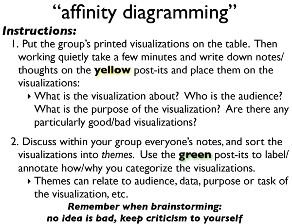
It's the "sticky note" concept to group data... More formally, it's a group decision-making technique designed to sort a large number of ideas, process variables, concepts, and opinions into naturally related groups. These groups are connected by a simple concept. These ideas can be posted on Post-it note pads for eventual grouping, sorting, pattern finding, etc.
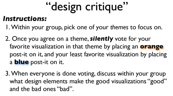
Explain the Design Critique phase
With respect to perception, what are some of the differences between our eyes and a camera?
(1) Our eyes are task directed; (2) cameras have evenly distributed pixels whereas our eyes pixel focus is concentrated; (3) we have a brain which does visual processing in a hierarchical manner ; (4) in the brain, we get what we focus on, e.g., finding a red dot; (5) the brain is both bottom-up and top-down.
Explain the difference between bottom-up and top-down processing:
In bottom-up, the brain processes what we see up into the brain into cognition. We see low-level features which get processed in the brain as, "That's a dog..."
In top-down, the process starts from cognition in the brain down in HOW we see things. Optical illusions are top-down: The brain is wired a certain way and creates an illusion that something is appearing a certain way--when it is not.
Explain the hierarchical nature of bottom-up and top-down visual processing:
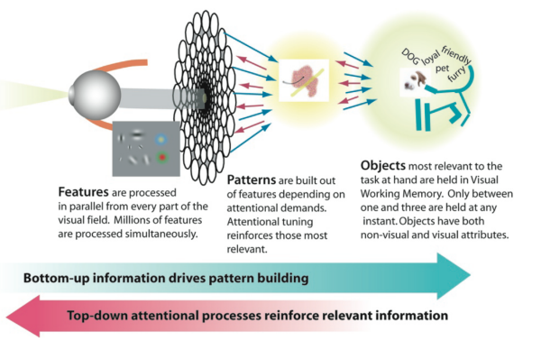
Both happens simultaneously. In bottom-up, information drives pattern building: An image comes in through the eye then patterns or shapes emerge then they are converted to "objects" in our mind from which we form ideas, opinions, actions, etc. Top-down attentional process reinforce relevant information, i.e., in a very simple sense, we get what we are looking for. So when SEEING a dog, that information gets processed bottom up--and when we look back at the dog, the information about the dog becomes clearer (top-down).
What is very important with respect to bottom-up and top-down visual processing as it relates to data visualization?
The brain COMBINES both bottom-up and top-down information. Therefore, we have to pay attention to C.R.A.P. principles (contrast, repetition, alignment, and proximity) but we also have to keep in mind 'what will the user pay attention to'?
Name a common problem with design and visualizations today:
People are designing visualizations because they can (or have to), not because they're good at it.
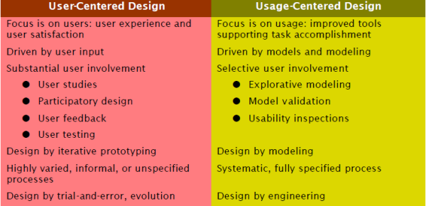
Compare USER-centered design vs. USAGE-centered design:
Name Dieter Rams' ten principles of "good design"
Innovative, makes a product useful, aesthetic, makes a product understandable, unobtrusive, honest, long-lasting, thorough, environmentally friendly, as little design is possible
Regarding "data encoding," comment on how to display continuous data vs. discrete data in charts:
If you have continuous data, use a continuous charting format, such as a line chart. If you have discrete data, use a discrete data display format, such as a bar graph.
What is a bumps chart?
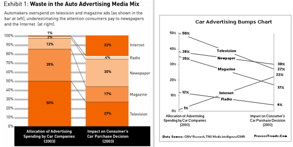
Bumps charts are great for comparing multiple data sources between two discrete points, e.g., comparing allocation of various channels of media spending vs. their comparative effect on purchases (see above)
In bar charts, which is better to use? 2-D or 3-D?
Studies of shown that 3-D is a no-no it is difficult to use and interpret, especially compared to 2-D. Just don't use 3-D (except if you have a spatial relationship to show such as air flow over an aircraft wing...)
Graphically, which is easier to compare: line charts or line charts that are filled in, taking advantage of the negative space?
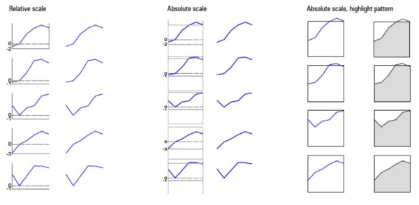
Line charts that are filled in are easier to compare than just simple line charts because cognitively, we are comparing "shapes" rather than ratios, trend, slope, etc. (see above for evolutionary comparison, left to right, of an actual design process...)
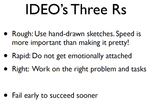
What are IDEO's Three Rs?
In Design Flow process, what is the ratio of time spent between the target and translation phases vs. the design and implementation phases?
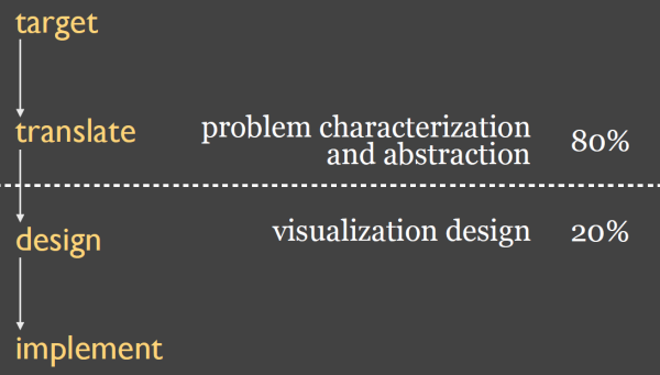
It's roughly 80% / 20%: More time must be spent on characterizing and abstracting the problem vs. visualizing a solution and design.
Is IDEOs Design Flow process top-down or iterative?
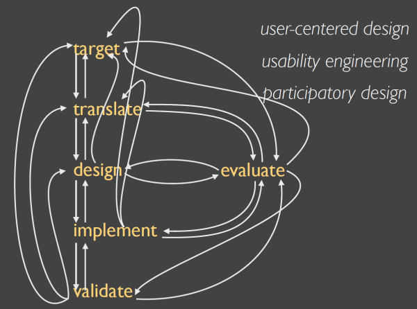
Its' iterative (see above)
What is the waterfall model of design?

The waterfall model is a popular version of the systems development life cycle model for software engineering. Often considered the classic approach to the systems development life cycle, the waterfall model describes a development method that is linear and sequential. Waterfall development has distinct goals for each phase of development.
Disadvantage: It constrains users from going back to prior steps in the process. Designers are moving away from it into agile development and other methods.
Explain the agile development model:
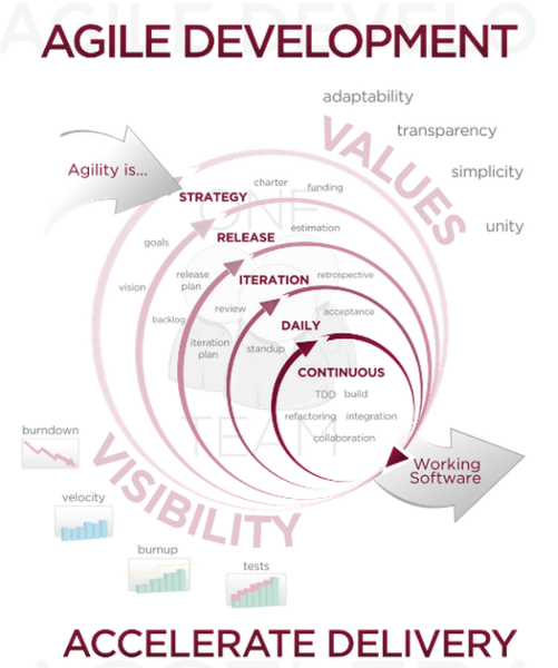
Agile software development is a group of software development methods based on iterative and incremental development, where requirements and solutions evolve through collaboration between self-organizing, cross-functional teams. It promotes adaptive planning, evolutionary development and delivery, a time-boxed iterative approach, and encourages rapid and flexible response to change. It is a conceptual framework that promotes foreseen interactions throughout the development cycle.
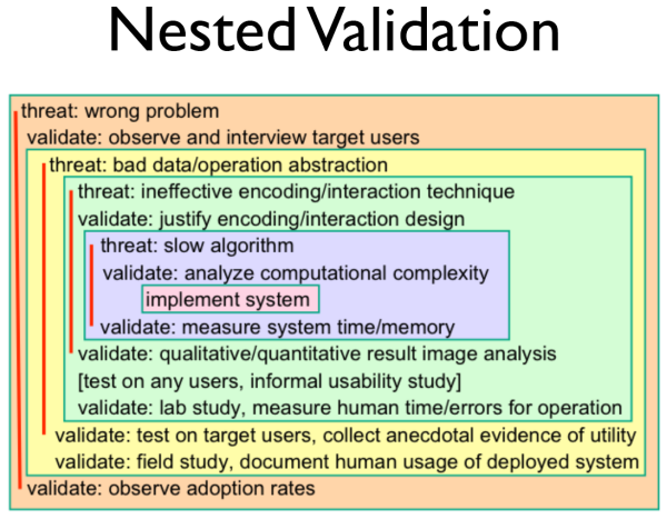
Comment on "nested validation" as it pertains to design:
What is Mechanical Turk as it pertains to data visualization?
It is crowdsourcing service (hosted by Amazon) that pays people to do various computer tasks. For example designers can visually test their models by paying small amounts to crowdsourced users to perform evaluations. On the receiving end, it lets people earn money for doing small computer tasks like eyeballing and commenting on photos, answering questions about websites, etc.
Give examples of the taxonomy of data:
Text, time series, tabular data (spreadsheets / database), images, sound, networks (relationship diagrams), fields (vectors in multiple dimensions), maps
What is the difference between Data Models vs. Conceptual Models
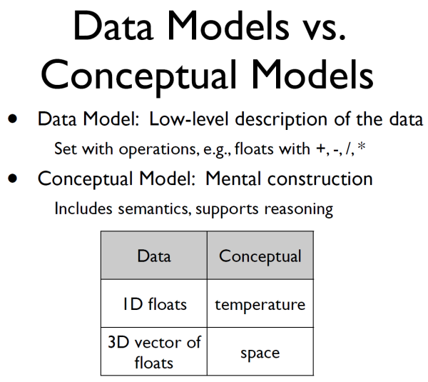
Data model describes the data (integers, floats, operators +, -, *, etc.) Conceptual models relate to semantics. For example, data model of a one-dimensional measurement of data coming in from a sensor over time is, in the conceptual realm, temperature measurement.
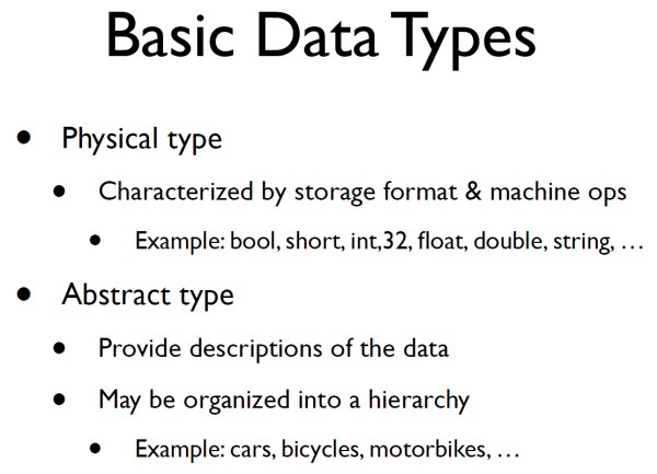
What are the differences of Physical vs. Abstract Data Types?
What is the formal definition of measurement?
Measurement, in the broadest sense, is defined as the assignment of numerals to objects or events according to rules.
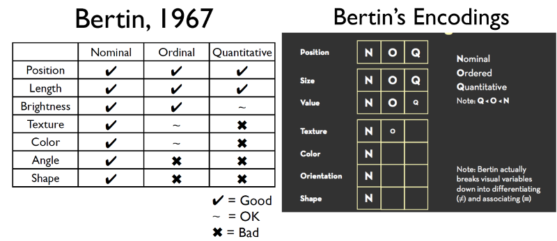
Elaborate on the four Data Types:
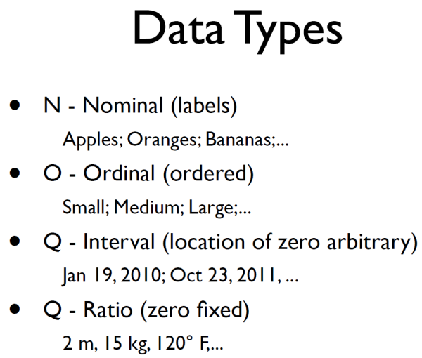
In diagram, "Q" = quantitative. Regarding Q-interval, we don't care where the zero is, for example, as in dates. What we care about is the difference between dates. For Q-Ratio, we do care where the zero is; this is typically for scientific data (e.g, length, weight, etc.)
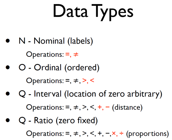
What are the operators on the four data types?
For nominal, we only care if something is equal or not. For ordinal, this is where we compare-- is something larger or smaller? In interval we add addition or subtraction so we can, for example, compute distances. In ratio, we add multiplication and division to calculate proportion.
Review use of data types with various channels:
What is the process of going from data model to data type?
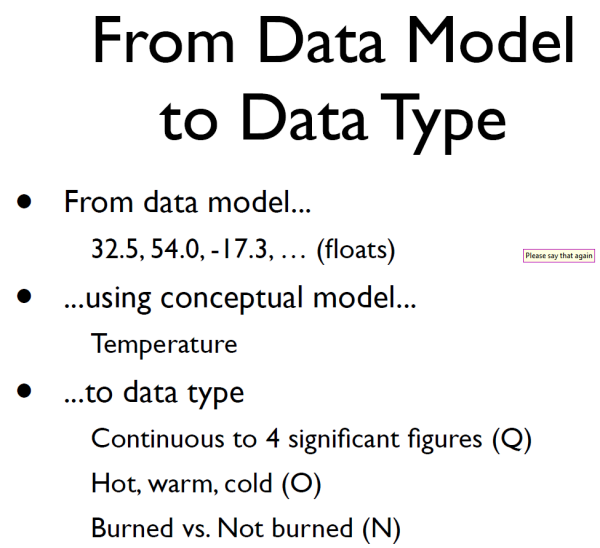
(1) We consider the data coming in; (2) from that we derive a conceptual model, for example, temperature; (3) and from that we decide on the data type. For example, if measuring temperature do we need to round to four figures (quantitative); or do we consider the temperature is either hot, warm, or cold (ordered); or do we take a more binary approach and say that the toast is either burned or not burned (nominal).
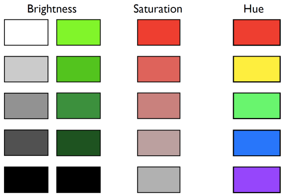
Between brightness, saturation, and hue, which are good for ordinal data?
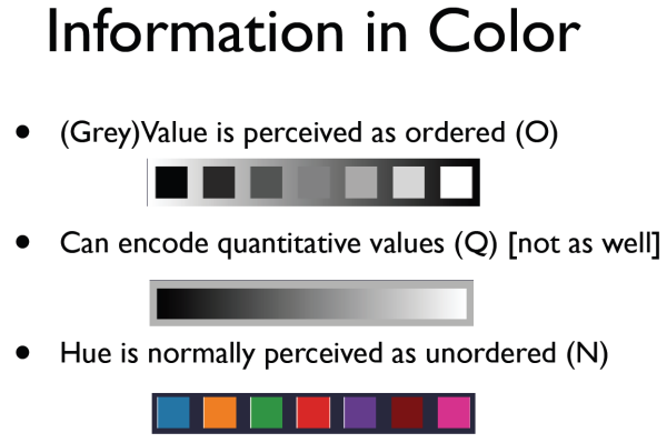
Brightness and saturation. Hue is best for nominal data--so you can use hue to label data.
Name some places where texture should not be used:
Bar charts (violates Tufte's principle of data-to-ink ratio); maps -- but not to be confused with maps that show contours or use contours to show elevations as part of a shape, like of a rock.
What is the Principal of Consistency?
Properties of the image should match the properties of the data (Tufte)
What is the Principle of Importance Ordering?
Encode the most important information in the most effective way
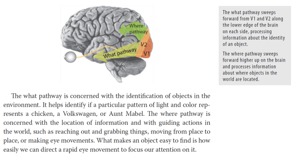
What are the "what" and "where" pathways of the brain?
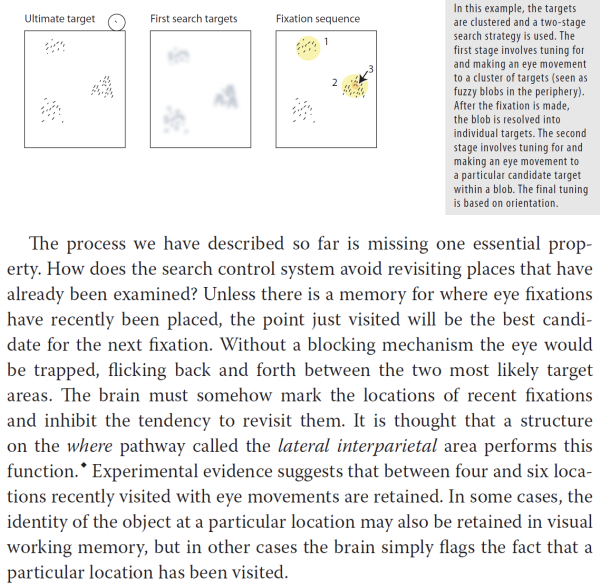
With respect to visual queries, what is the mechanism known as biased competition?
Is the mechanism in our brains that when we go for example searching for tomatoes, it's as if the brain is saying, "All of you read sensitive cells you all have permission to shout louder. All you blue– and green–sensitive cells, try to be quiet." The same biased shouting mechanism also applies to any of the feature types processed by the primary visual cortex, including orientation, size, and motion.
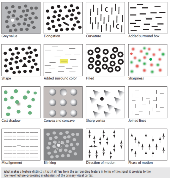
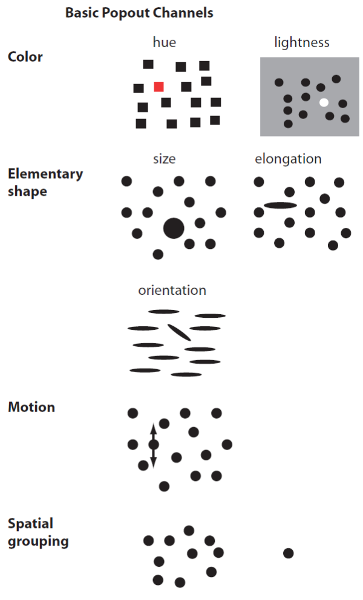
During visual queries, which features lead to a pop out (salience)?
Th e simple features that lead to pop out are color, orientation, size, motion, and stereoscopic depth.
How long this processing take to determine if an object pops out from its surroundings? Why is this important for data visualizations?
Something that pops out can be seen in a single eye fixation and experiments show that processing to separate a pop-out object from its surroundings actually takes less than a tenth of a second. Things that do not pop out require several eye movements to find, with eye movements taking place at a rate of roughly three per second. Between one and a few seconds may be needed for a search. These may seem like small differences, but they represent the difference between visually efficient at-a-glance processing and cognitively effortful search.
Name 10 features that make an object pop out from its surroundings:

Even when told to look for the green squares (pre-attentive "tuning"), why don't they pop out?
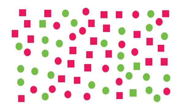
Trying to find the target a son to features is called a visual conjunctive search, and most visual conjunctions are hard to see. The green squares do not show a pop-out effect, even though you know what to look for. The problem is that your primary visual cortex can either be tuned for the square shapes, or the green things, but not both.
Are features that pop out hard wired into the brain--or can we learn to spot them through practice?
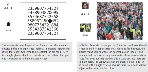
Features that do pop out are hardwired into the brain. As it relates to trading, for example, with practice experts can interpret patterns that non-experts fail to see. But this expertise applies more to identifying patterns once they have been fixated with the eyes, and not to finding those patterns out of the corner of the eye .
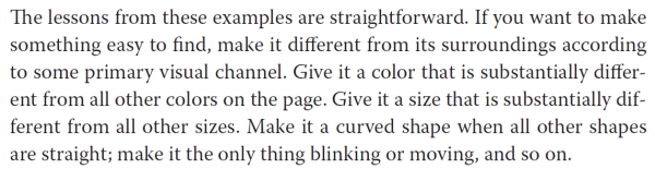
Given how are brains are hardwired, how can we as designers make things pop out?
Given how our brains are hardwired, how do we support visual queries in design when we need more than one element to stand out?
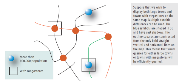
A design to support a rapid visual query for two different kinds of symbols from among many others will be most effective if each kind of query uses a different channel. We can use shape coding for one and color coding for the other, for example. Also, we can hierarchically subordinate one element to another by adding, let's say, three channels to one element and to channels to the other, thereby making them both pop but one more than the other.
At an evolutionary level, where does our sensitivity to motion come from?
It likely comes from our need for safety when our surroundings change, for example, movement in the brush in the Savannah will help us from becoming some creature's lunch. Our sensitivity to static detail. Very rapidly away from the central fovea. Our sensitivity to motion. Much less, so we can still see something is moving out of the corner of our eye, even though the shape is invisible.
How can the foregoing concepts improve on the "text-on-charts" application?
By converting the text to a uniform decision making structure using visual queues. Your Decision Bars was a step in this direction. All indicators could conceivably be pumped into the decision bar format which could either be displayed at the bottom of the chart on a bar-by-bar basis--or in a right hand margin of symbols from which the trader can act on from a top-down cognitive basis.
Rather than place buy-sell arrows above areas on charts, how can the signal generation process be enhanced on charts?
By first removing all prior signals unless user is in a research mode. Secondly, by placing signals in a predictable area so trader is not constantly scanning the chart landscape for a signal. (See Visual Thinking for Design, pp. 43-44.)
Name the basic pop-out channels:
What helps the brain find an object and distinguish it from others in the environment?
Finding the boundaries of an object is an important function of the pattern processing systems. In order for the brain to find an object, it must somehow be distinguished from other objects in the environment, and often the most important piece of information is that it has a continuous contour running all around it. In the trading realm, that means the current bar you are looking at is almost indistinguishable from others nearby and it takes comparatively more cognitive energy to resolve what you are seeing.
What is binding as it relates to visual processing?
The process of combining different features that will come to the identified as parts of the same contour or region is called binding. There is no such thing as an object embedded in an image; purchase patterns of light, shape, color, and motion. Objects and patterns must be discovered, and binding is essential because it is what makes disconnected pieces of information into connected pieces of information.
What is visual interference?
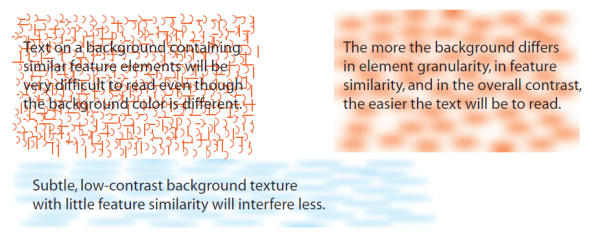
As a general rule, like interferes with like. This is easy to illustrate with text as shown above. To minimize this kind of visual interference (it cannot be entirely eliminated), one must maximize feature level differences between patterns of information.
What is feature level tuning?
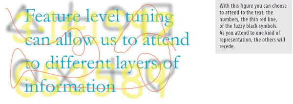
When there are multiple layers of information we can attentionally choose to focus on just one and the others will fade into the background.
By way of analogy, what's the difference between small-scale patterns and large-scale patterns?
Objects in the real world have structure at many scales. In the garden, for example, individual flowers provide small-scale patterns, and these are organized into patches of color depending on the design of a flower bed. The entire structure of lawns, flowerbeds, trees, and pass form a large-scale pattern.
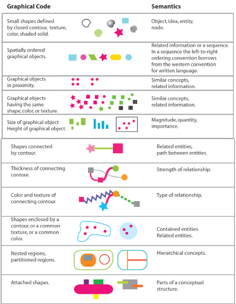
Give some examples of how relationships between meaningful graphical entities can be established:
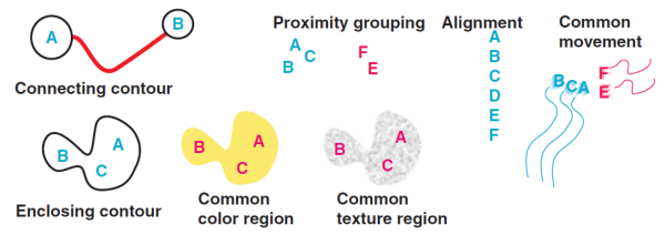
Relationships between meaningful graphical entities can be established by any of the basic pattern-defining mechanisms: connecting contours, proximity, alignment, and closing contour, color, texture, and common movement.
In spoken language, phrases such as connected to, built on, contained within are so common that we do not even think of them as metaphoric. They are basically spatial metaphors in natural language. What are the basic spatial metaphors in graphic design?